A homepage that sells strategic clarity as clearly as she does
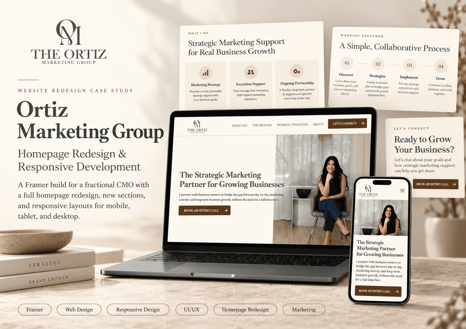
A full homepage redesign in Framer for a fractional CMO: new layout, new sections, and distinct layouts for mobile, tablet, and desktop.

The Problem
Blanca Ortiz built Ortiz Marketing Group around a clear thesis: growing businesses need strategic marketing leadership, but most can't justify a full-time CMO hire. She fills that gap, bringing objective, senior-level strategy to companies that need it without the overhead of a full-time executive.
The problem: the homepage wasn't communicating that thesis with the same precision she brings to her clients. The layout was functional but unstructured. The three service tiers, each designed for a different business stage, weren't differentiated clearly enough for a visitor to immediately know where they fit. On mobile, the experience fell short of the professional standard the brand needed to establish.
If you're selling strategic clarity, your homepage has to demonstrate it before a visitor reads a single line. The layout communicates your thinking before the copy does.
The brief was a full homepage redesign in Framer: new layout, new sections, and responsive optimization across mobile, tablet, and desktop. Not a patch job on the existing structure. A proper rebuild.
The Approach
The redesign was built in Framer, the right tool for a high-quality marketing site that needs to look sharp across devices without backend overhead. The core design challenge: translate a nuanced advisory offer into a homepage that communicates instantly, to a business owner who has fifteen seconds and a healthy skepticism about marketing consultants.
The layout was rebuilt from the top. The hero section leads with the core value proposition and a direct CTA, no ambiguity about what Ortiz Marketing Group does or who it's for. A dedicated problem section follows, naming the specific pain points: marketing that feels like a black box, vendor relationships that don't talk to each other, and spend that can't be traced to outcomes. Making the prospect feel understood before pitching the solution is the right sequence, and the new layout enforces it.
New sections were added to fill gaps the original site left open. A numbered three-step process section, built in Framer with structured cards, makes the engagement model immediately legible. A team bio section establishes Blanca's credibility directly on the homepage, not buried in an about page. A closing CTA band ensures there's a clear next action for every visitor who makes it through.
Every section on a homepage should have a conversion job. If it doesn't move a visitor closer to a decision, it's taking up space that should be doing real work.
The service tier section got a full rebuild. The Blueprint, The Structural Review, and Monthly Advisory are three distinct offers for three distinct business situations: a startup that needs a foundation, an established business that needs an audit, and an ongoing client who needs a strategic partner. The redesign gives each tier its own structured section with defined deliverables and clear positioning, so a visitor can self-qualify before they ever reach out.
Responsive optimization was treated as a first-class design problem, not an afterthought. Framer's breakpoint system was used to build genuinely distinct layouts for mobile, tablet, and desktop, not just a stacked mobile collapse, but layouts adapted to how each device is actually used. Mobile gets simplified navigation, vertically stacked components, and CTAs sized for thumbs. Tablet gets a transitional layout that retains visual hierarchy without crowding. Desktop gets the full structured layout with the visual weight it earns.
The Results
The redesigned Ortiz Marketing Group homepage launched on Framer, a structured, conversion-oriented site that communicates the advisory offer clearly and works across every device a prospective client might use to evaluate it.
- Clear homepage architecture from top to bottom. A full layout rebuild: hero, problem statement, three-step process, service tiers, team bio, and closing CTA, with each section structured to move a visitor closer to a decision. No filler, no ambiguity.
- Three service tiers, clearly differentiated. The Blueprint, The Structural Review, and Monthly Advisory each have their own section with defined deliverables and distinct positioning, giving visitors a clear path to self-qualify without needing to book a call just to understand the offer.
- Fully responsive across mobile, tablet, and desktop. Dedicated layouts at three breakpoints: genuinely adapted experiences for each device, not a collapsed mobile view. Mobile, tablet, and desktop all render with the hierarchy and visual quality the brand requires.
- Built and shipped on Framer. The site runs on Framer: fast-loading, high-design-quality, and easy to iterate without developer involvement for content updates. The right infrastructure for a consultancy whose homepage needs to stay current as the business evolves.
Anas was wonderful to work with. He is very knowledgeable, detail-oriented, and very fast. He completed the entire scope on time and accurately. -- Blanca Ortiz, founder
Building something similar?
Get a free 20-minute strategy call and we can talk through what is in the way.
Get a free 20-minute strategy call →