Rebuilding the tool 3,000+ dealers rely on to run their marketing
A full UX overhaul of John Deere's Dealer Advertising Resource, redesigned around two distinct user types after research with 15 admins and dealers.

The Problem
John Deere's Dealer Advertising Resource is the platform authorized dealers use to access co-op advertising funds, pre-designed marketing materials, brand guidelines, and campaign management tools. It's not a nice-to-have. For dealers, it's the engine behind their local marketing.
The problem was that the platform had aged badly. The admin view was cluttered and slow. The dealer-facing co-op marketing tool required too many steps, hid the materials dealers needed most, and made campaign creation feel more like a compliance exercise than a business activity. Two very different user types, administrators overseeing programs and dealers executing campaigns, were being forced through the same awkward interface.
It takes so much time to navigate through the marketing tool and customize the materials, per Sarah, a dealer
The mandate was clear: overhaul both views. Give admins a dashboard built for decision-making. Give dealers a campaign creation flow that felt intuitive, not punishing. Do it within John Deere's strict brand and UX guidelines. And do it with a lean team: one designer, three developers, a project manager, and a technology director.
The Approach
I started where I always do: with the people actually using the product. Before touching a wireframe, I spent four weeks defining research objectives and building a structured survey, a mix of open-ended questions, multiple choice, and ordinal scales, to surface real pain points from the people who lived in this tool every day.
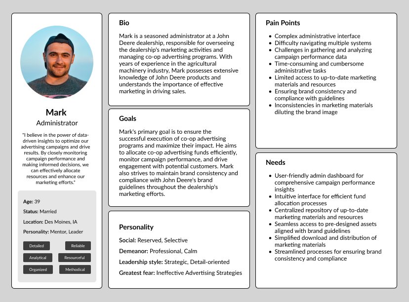
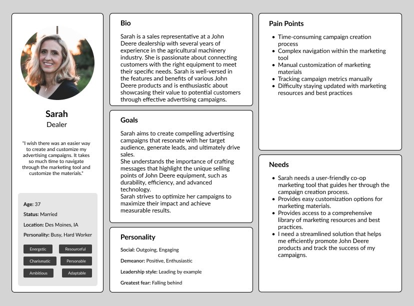
From 15 survey responses, two distinct personas emerged, Mark the administrator and Sarah the dealer, each with fundamentally different goals, workflows, and pain points. These personas became the north star for every design decision that followed.
I believe in the power of data-driven insights to optimize advertising campaigns and drive results, per Mark, an administrator
With research complete, I moved into wireframing in Adobe XD, translating survey insights and persona needs into low-fidelity screens, then running a round of user testing before touching any visual design. The feedback loop was tight and intentional: test early, iterate often, avoid building the wrong thing beautifully.
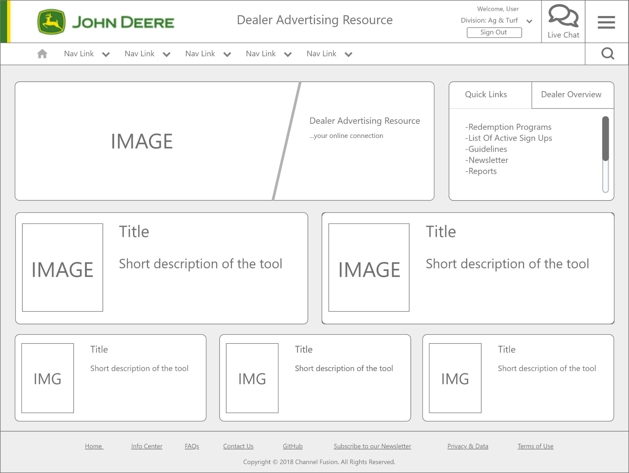
The final UI phase required working within John Deere's established design system: JD Sans Pro typography, the full brand color palette (JD Green, JD Yellow, and the construction equipment range), and their UX guidelines for navigation and hierarchy. The constraint was actually an asset: it kept the focus on solving usability problems rather than aesthetics debates.
John Deere brand color system
The Results
After eight-plus weeks of testing and iteration, the redesigned platform delivered two meaningfully different experiences for two meaningfully different users, without fracturing the system or violating brand standards.
- Streamlined admin dashboard. Admins got a clean, organized view with direct access to campaign performance metrics, fund allocation tools, and compliance oversight, reducing the need to navigate across multiple systems.
- Intuitive campaign creation for dealers. A step-by-step co-op campaign flow with pre-designed, brand-compliant materials surfaced at the right moment, cutting the time dealers spent customizing and launching campaigns.
- Research-driven design process. 15 participants across admin and dealer roles, 5 design stages, 8+ weeks of iterative testing: a rigorous process that grounded every decision in real user behavior rather than assumption.
- Full John Deere brand compliance. Every screen built to JD's UX guidelines: JD Sans Pro typography, brand color system, and interaction patterns, ensuring the redesign could ship without brand review friction.
Building something similar?
Get a free 20-minute strategy call and we can talk through what is in the way.
Get a free 20-minute strategy call →